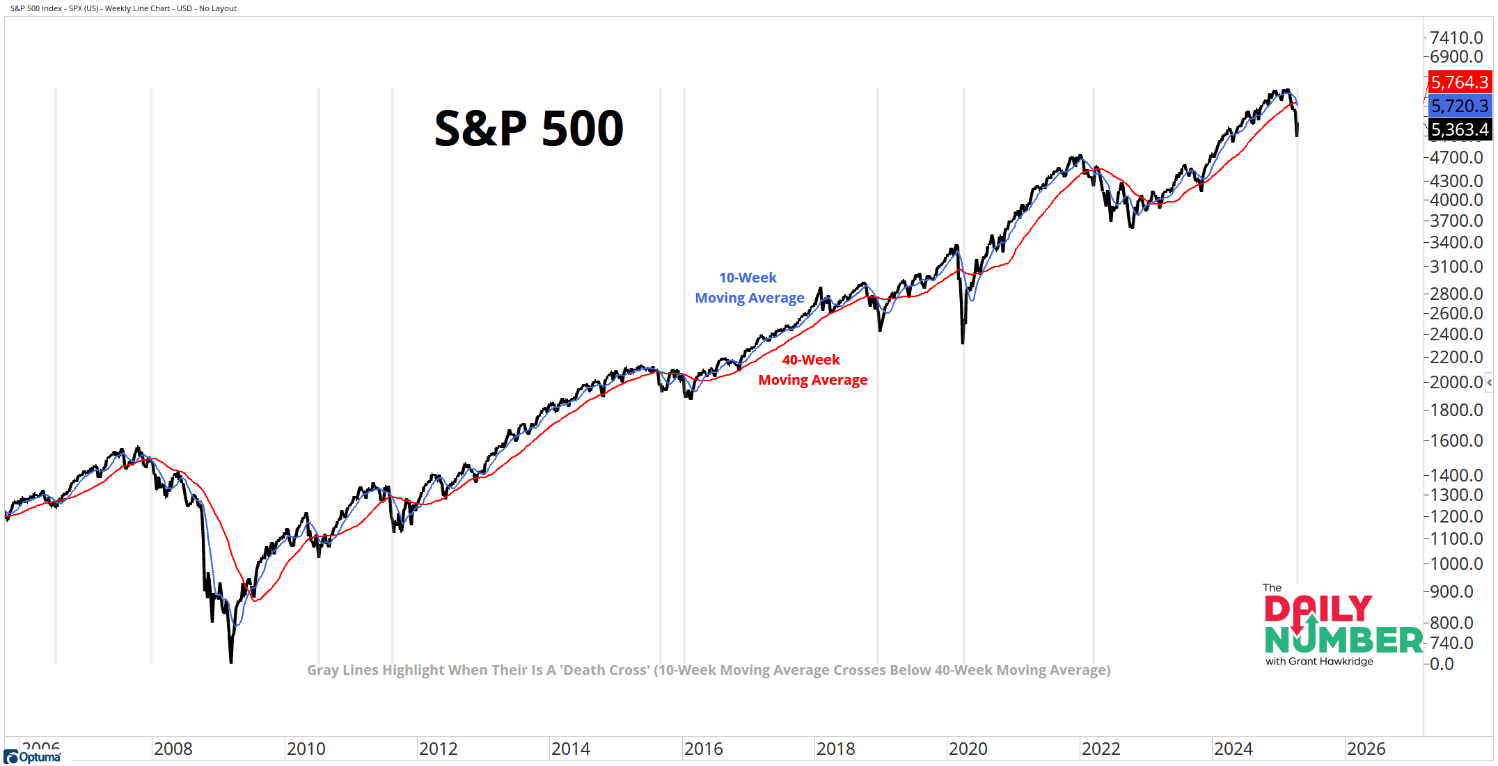
The 10-week moving average of the S&P 500 has fallen below the 40-week moving average for the 42nd time since 1950.
Here’s the chart:
Let's break down what the chart shows:
The black line is the S&P 500 index price.
The blue line is the 10-week moving average of the S&P 500 index price.
The red line is the 40-week moving average of the S&P 500 index price.
The gray lines highlight when the 10-week moving average crosses below the 40-week moving average - Also known as a Death Cross.
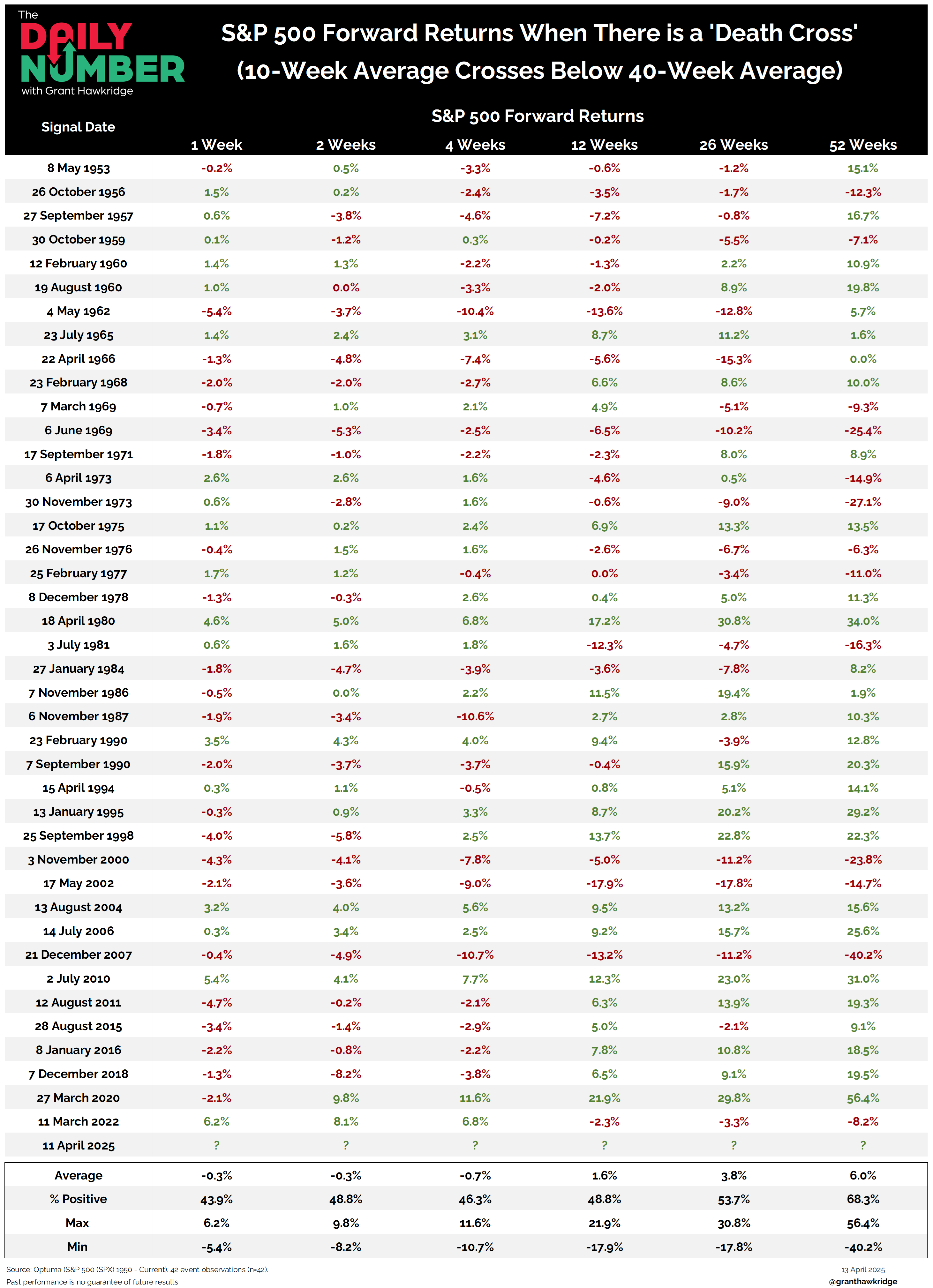
The table showcases the forward returns of the S&P 500 following a Death Cross.
The Takeaway: The trend is your friend until it bends, and the S&P 500 has been in an uptrend for the past 115 weeks.
But that changed last week when the S&P 500 experienced a Death Cross, which adds to the evidence in favor of Bears.
But what exactly is a Death Cross?
A Death Cross is a technical indicator that occurs when a short-term moving average (10-week moving average) crosses below a long-term moving average (40-week moving average). This indicator is used to identify a shift in market trends from bullish to bearish.
Some people may place limited emphasis on the Death Cross pattern because it is often considered a lagging indicator. However, historical data suggests that if the short-term moving average remains below the long-term moving average, it could pose challenges for stocks moving forward.
I have done the math, and the results are bearish for the stock market… Take a look at the table above for more details.
On average, the S&P 500 has poor performance over the next 1 to 3 months.
Is this the kind of environment where we want to invest our capital? The impact on stocks in the near future will depend on how long it takes before we see a Golden Cross, which is the opposite of a Death Cross.
If you find my content valuable, I would greatly appreciate it if you could share it with your friends, family, and colleagues. Your help in spreading the word is invaluable in supporting our work. Thank you to all of you who share!